This week I am participating in an online VLE conference and I came across this graphic on a slide in a presentation by Philip Butler (Senior e-Learning Adviser for JISC's London RSC) - apparently it originates in the States with someone called Andrew Williams (new name to me). So hat tips in all the right directions.
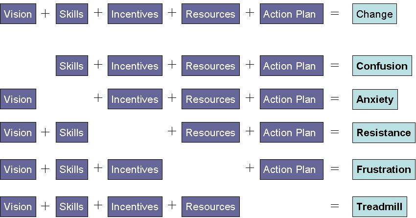
At first I thought it was just a bit of glib rah-rah stuff, but as Philip unpacked it in his presentation I realised how much good, solid sense it made. It had obviously been well thought out. This is the sort of thing that needs to be converted into a poster for some people's office walls, and taped to a few mirrors.
If your organisation is going through change at the moment: adopting a new LMS; going Web 2.0; getting to grips with teaching-with-technology, and struggling a bit, I recommend that you have a look at the diagram and identify the missing piece(s).
Hi Karyn,
ReplyDeleteFound a link to your blog referring to the great diagram - and it most certainly is! Thanks for sharing this - I'm just waiting for the A1 poster to come out.. can think of a fair few walls that need it!